
Tasks Performed
Competitor Analysis
UI Design
User Flows
Wireframing
Prototyping
Illustration
Logos
Graphic Design
What is Lovestruck?
Lovestruck was a romance visual novel app owned by Voltage Entertainment U.S. It housed multiple stories all in one place.
Overview
Since all the stories were made in-house, I was brought on to create all the UI, logos, title cards, and marketing banners for each of these stories. Every story followed my system of deciding on a theme, creating a mood board, creating a style guide, sketching variations, and delivering final designs.
Role
UX Designer
UI Designer
Team
Self
Tools
Figma
Adobe Photoshop

Screens
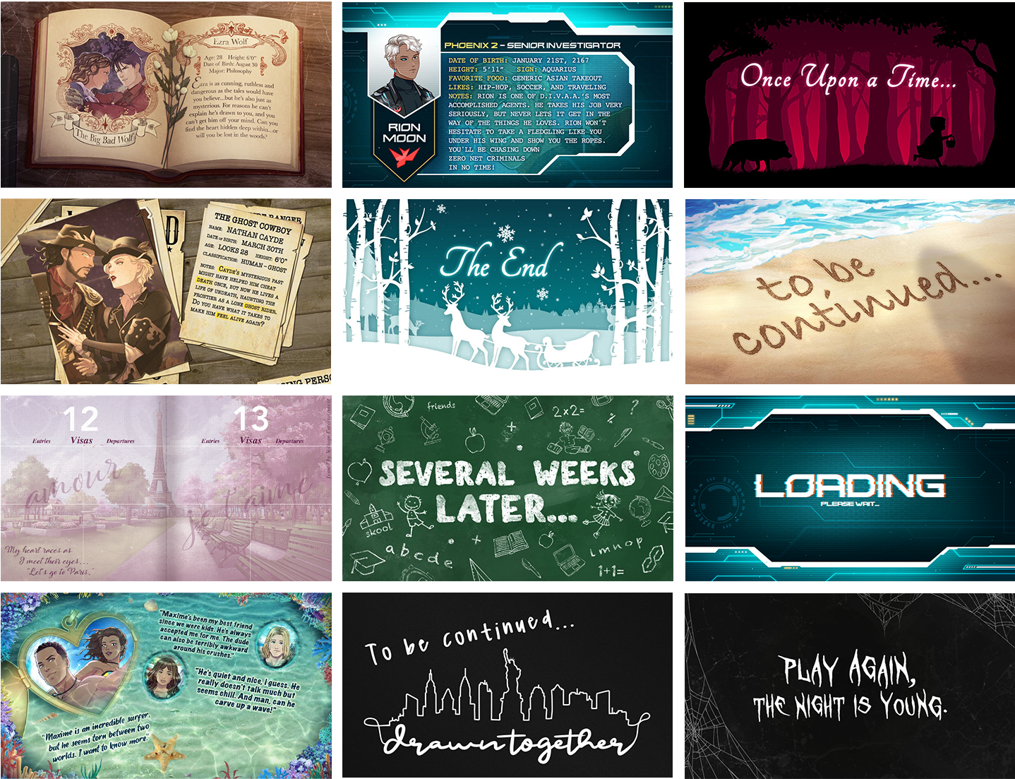
Every story required title cards and character sheets. I was responsible for creating them all.
Marketing
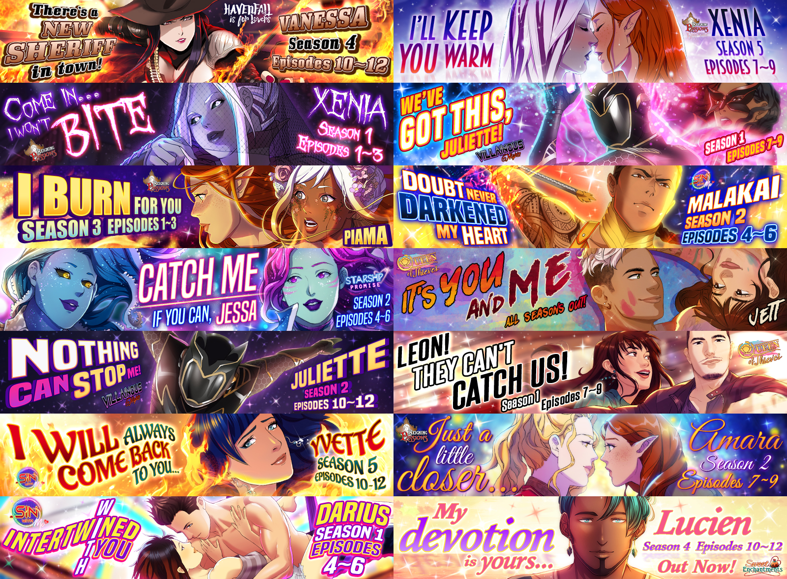
Everyday a story updates with a few episodes, so to advertise the releases, I would create in-app banners.

Logo Designs
Every new story was vastly different from the last and the themes varied. My role was to create logos to match the theme of the story.
App Redesign - Incomplete
As our catalogue of games grew, the company wanted to take the opportunity to update the entire app. I was tasked to take charge of this. Unfortunately during the initial stages of this project, the company had shut down.
Goals
-
We have over 80 characters to read, yet users are only sticking with a few of them. How can we get them to discover and attempt to play other characters?
-
We developed a camera feature, yet no user has used it. How can we get them to try it out?
What Did Users Say?
I sent out multiple surveys over the time I worked here and scrubbed through all social media outlets to find out what users were saying about the app.
Player Feedback
-
It's too tedious to try out new characters.
-
It's inconvenient to search for specific chapters in order to replay a different route.
-
Wished it was easier to find their favorite types of characters.
-
Didn't understand how the front page was organized.
-
Found it frustrating that they needed to check the social media accounts for updates and information causing them to miss limited time events.
-
Didn't know about or didn't find the camera app valuable.
-
Wished there was more personalization.
Update To Lobby
-
I decided to keep the layout the same as I felt that the Netflix-style layout worked well and was on par with our competitors.
-
I changed the carousel banner to overlap each other so users would be curious to see what the next character in line was.
-
In order to increase discoverability, I added a Recommended Section based on what stories the users choose so it's more personalized as well as a Routes Ending Section to get users interested in binging characters that they forgot about.
-
The actual series section looked the same as the individual character story icons and they only show up when a character in that series is updated, so I updated the thumbnails to be much larger and to give them their own section so users have the option of looking at every series we offer.
-
I consolidated the top bar menu items into a side bar menu for ease of access and to keep clutter off the main page. I also added a search feature in this menu.
Discovery Page
-
I added a Discovery Page where users can search for specific stories or genres they were interested in.
-
I added a Character Spotlight section at the top in order to help push interest in characters that are not getting any attention.
-
I separated the stories by genres and added tags for users to filter out stories they aren't interested in.
-
Users can now use a search bar to find their favorite characters and stories.
Series Page
-
I moved the series poster to the left and made it much larger so users can actually see what the image looks like and to generate curiosity.
-
I kept it simple and only created a section for the characters.
-
When a user taps on a character, their information pops up. I added dropdown menus for users to not only browse seasons, but also specific chapters.
Camera
-
The only thing the camera feature could do was take a selfie, add a border around it, and download it to their phone. I recommended we expand it to something more creative.
-
I rebranded it to be a dressing room where users can either take photos of themselves, or use a character sprite from one of the stories.
-
I added a shop where users can purchase assets to use in their photo using in-game currency.
-
In addition to being able to download their photo, they can also use their custom design as their profile picture within the app making the experience more immersive.
News Feed
-
I added a News Feed where we can announce various events without having to leave the app.
-
Social Media links are found at the bottom for users to follow if they'd like.